DUE TO SPAM, SIGN-UP IS DISABLED. Goto Selfserve wiki signup and request an account.
...
Below there are 5 additional logos for the Apache OpenOffice project, all of these follow a similar language to logo proposal 2. 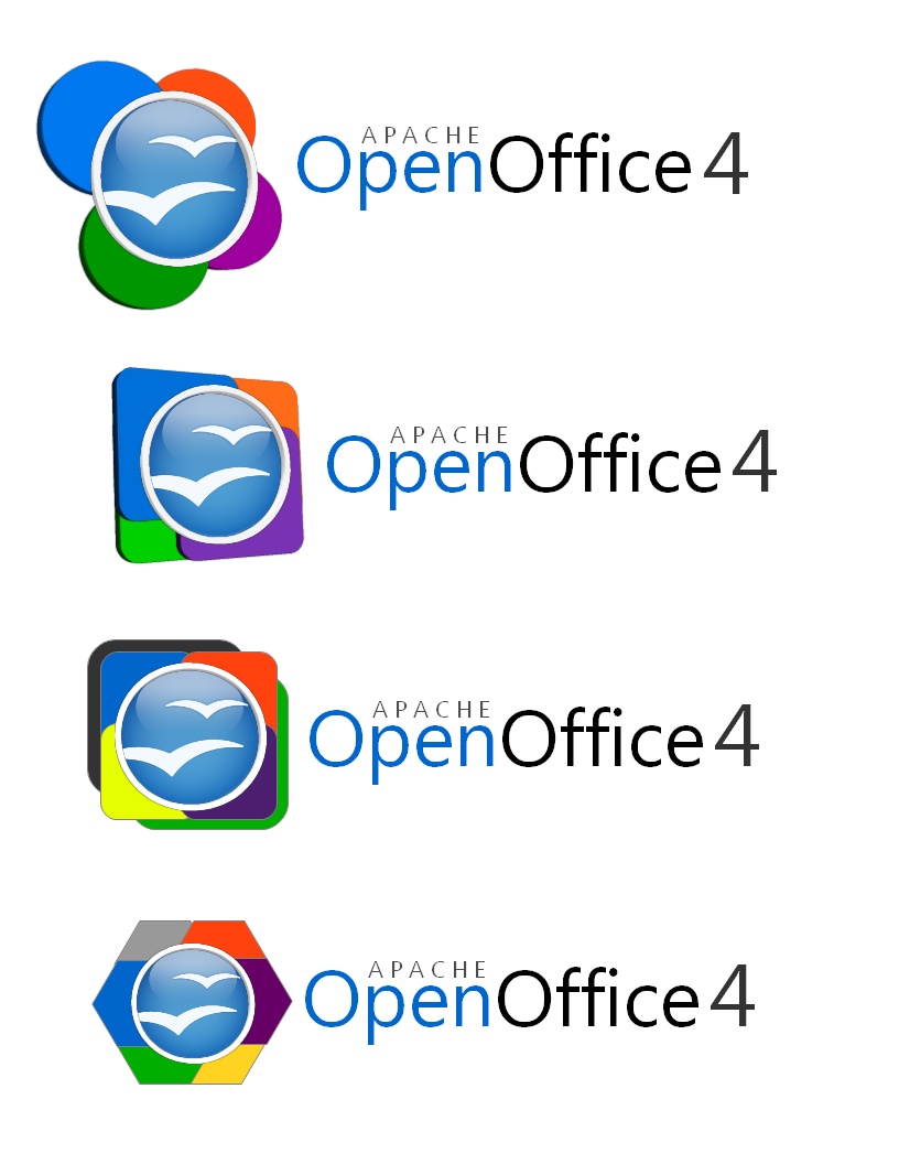

JZA - AOO 4 Logo proposal
A design quite different from the Gulls and even the parameters used. The logo applies more basic elements with a second version that is more complex. It tries to emulate some symbolism of continuity and dynamic evolution. Is not meant to be a finished design but the inspiration to think different about logos and image of the product.

A more complex version with something that is between feathers or the flow of water. It add some dynamism and speed to the continuity symbol.

Some suggestions on improving the fonts and color combination has already been contributed. A more rounded and contrasting font might improve the impact of the logo.
Notes
- consider a logo content, as seen in Flex
- Apache OpenOffice is a continuation of OpenOffice.org, consider retaining aspects of previous OpenOffice logo for continuity
- consider including Apache in logo
...