DUE TO SPAM, SIGN-UP IS DISABLED. Goto Selfserve wiki signup and request an account.
...
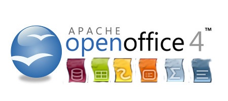
This is a rough draft of my thoughts for a logo. Borrowing the text portion from Michael Acevedo's proposal and the 3.4 orb.
Colors are added as a bar beneath text. The "S" shapes ends of the colors are from the icons (Sun styling I think?).
The colors could be attached together and gradient applied maybe.
I hope if someone likes this they can pursue it further as I'm not an artist 
10. Samer Mansour - Logo Proposal & Branding Consideration
Inspired by Michael Acevedo's rounded square design in 6 & 8. Font is from Google Web Fonts, its OFL licensed. If we can't use font we can replace.
My goal is to keep it simple, Its not just a splash screen logo, its a brand, and this brand will need to spread through out the product. Icons, about, website, etc.
Simplicity in logo will help with branding challenges in busier layouts like the Website, About Screen, videos etc.
I picked the font because the font shape helps reinforce the logo's shape.
Opinion: User should be able to see an outline or silhouette of a logo and recognize the brand. The gulls are ours.
Black outline is to help focus eyes. Second image is to show application to other branding activities, done with less effort.