DUE TO SPAM, SIGN-UP IS DISABLED. Goto Selfserve wiki signup and request an account.
...
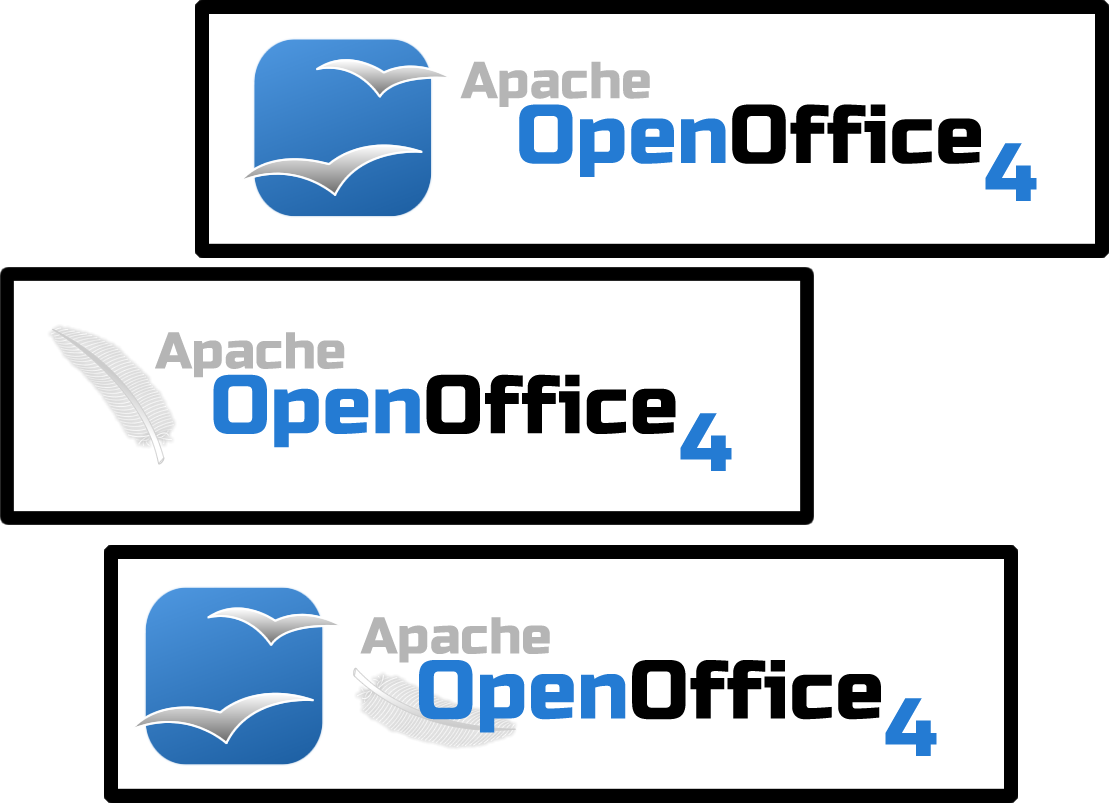
Black outline is to help focus eyes. Second image is to show application to other branding activities, done with less effort.
11. Chris R. - Clean flat style (Feb 2, 2013)
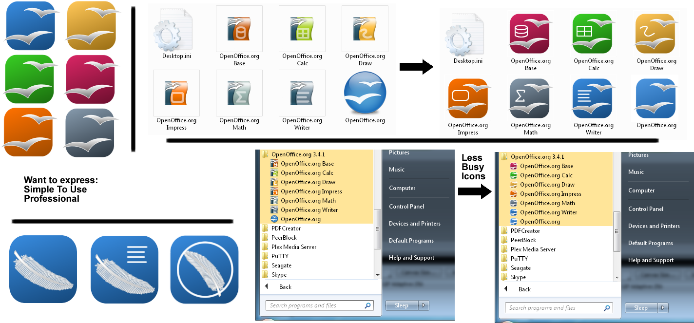
Just a rough fast brainstorm test 
Without glossy or other "modish" style. Left away all "unnecessary elements": the brand should speak for itself.
Scales not bad at smaller sizes (app icons here 64px), but this is just to give an idea of my idea: icons are not optimzed (line thickness, etc.)
...