DUE TO SPAM, SIGN-UP IS DISABLED. Goto Selfserve wiki signup and request an account.
...
Just a rough fast brainstorm test 
Without glossy or other "modish" style. Left away all "unnecessary elements": the brand should speak for itself.
Scales not bad at smaller sizes (app icons here 64px), but this is just to give an idea of my idea: icons are not optimzed (line thickness, etc.)

Lucas Filho - Concepts 02
Using Google to write, sorry errors.
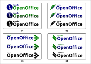
I present four proposals for logo Apache OpenOffice 4.0. In standard versions, and indeed black and white. For best viewing, download, and view separately.
01 - The proposal presents a shame apache inside a circle representing the world - ie, the world is Apache;
02 - Based on the scrawl of Kevin Grignon, the plane represents freedom. But we have two problems: the plane separately without the name does not remember the brand, we have no reference what it is. Second, I have already submitted a proposal similar to the LibreOffice project for some time (https://picasaweb.google.com/lh/photo/rht5jt8ISZiVAHIbyJ_QbtMTjNZETYmyPJy0liipFm0?feat=directlink );
);
03 - My favorite , shows six squares inclined. Each package represents programs (Writer, Calc, Impress, Base, Draw and Math). The set - name and objects, references an arrow (apache);
04 - The two objects can become a success in marketing. The two objects refer to painting done with fingers in the faces of Apache Indians. Imagine lectures around the world made with the speaker with his face painted (a headdress would be excellent to complement this case)!
This characterization would be a "trademark" of Apache OpenOffice. I'm not talking about using costumes through the streets, but the painting would be the basic (optional).
Em português:
Usando o Google para escrever, desculpe erros.
Apresento quatro propostas para logomarca do Apache OpenOffice 4.0. Em versões normal, com efeito e preto e branco. Para melhor visualização, fazer download e ver em separado.
01 - A proposta apresenta uma pena apache dentro de um círculo que representa o mundo - ou seja, o mundo é Apache;
02 - Baseado no rabisco de Kevin Grignon, o avião representa a liberdade. Mas temos dois problemas: o avião em separado sem o nome não lembra a marca, não temos referência do que se trata. O segundo, já enviei uma proposta parecida ao projeto LibreOffice há algum tempo (https://picasaweb.google.com/lh/photo/rht5jt8ISZiVAHIbyJ_QbtMTjNZETYmyPJy0liipFm0?feat=directlink);
03 - Minha preferida : ), mostra seis quadrados inclinados. Cada um representa os programas do pacote (Writer, Calc,Impress, Base,Draw e Math). O conjunto - nome e objetos, faz referência a uma seta (apache);
04 - Os dois objetos podem se transformar em um caso de sucesso em marketing. Os dois objetos fazem referência a pintura feita com dedos nos rostos dos índios apaches. Imaginem as palestras ao redor do mundo feitas com o palestrante com o rosto pintado (um cocar como complemento seria excelente neste caso)!
Esta caracterização seria uma "marca registrada" do Apache OpenOffice. Não estou falando de usar vestimentas pelas ruas, mas a pintura seria o básico (opcional).
