DUE TO SPAM, SIGN-UP IS DISABLED. Goto Selfserve wiki signup and request an account.
...
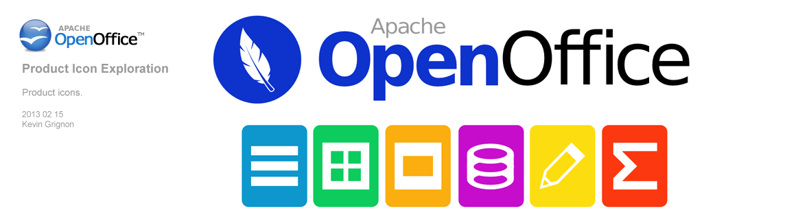
The following logo which I affectionately call "BlueCon", takes a cue of logo designs 9 and 10, but actually makes it simple by taking the multicolored rings away and repaints the icon to the OpenOffice blue color. As with proposal 9 and 10 seagull ring remains and the design for the word "openoffice" is carried over as well. This logo addresses observations made about logos 9 and 10 being "too crowded" due to the application rings. The new coloring of the icon represents the whole OpenOffice suite, something that the original seagull orb accomplished. Logo proposal 10 is oriented to be used on the office suite, where logo proposal 11 is geared towards being used on the project's webpage as the icon has been scaled down to be more header friendly. 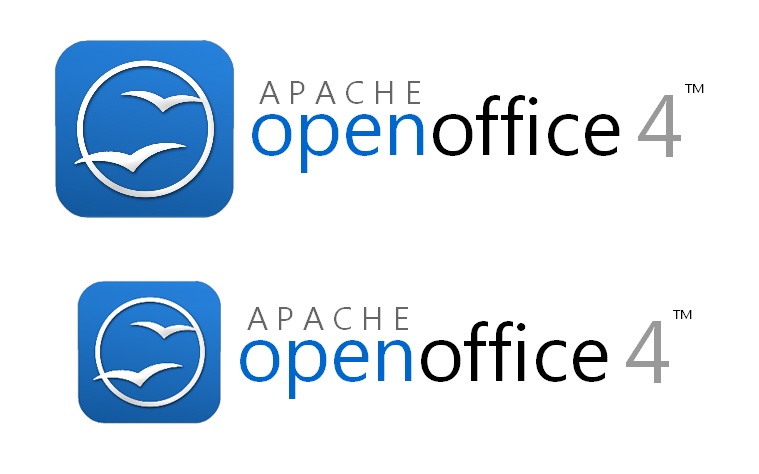
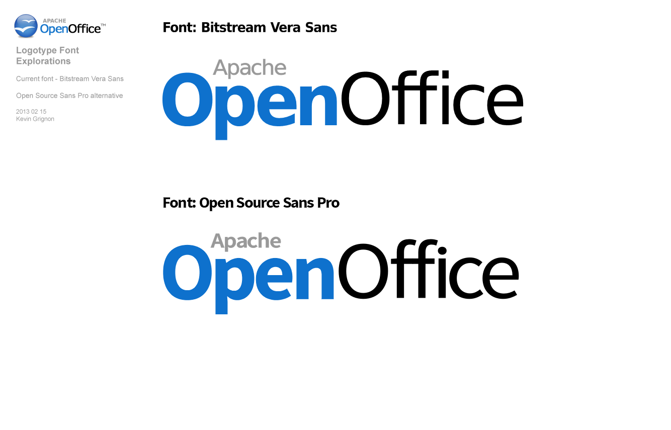
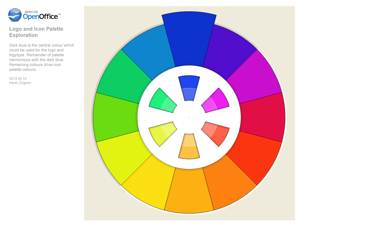
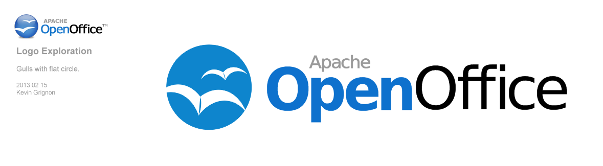
Kevin Grignon - Concept Logo for Apache OpenOffice 4.0 Proposals #12 and #13 (2-15-2013).

Notes
- consider a logo content, as seen in Flex
- Apache OpenOffice is a continuation of OpenOffice.org, consider retaining aspects of previous OpenOffice logo for continuity
- consider including Apache in logo
...