DUE TO SPAM, SIGN-UP IS DISABLED. Goto Selfserve wiki signup and request an account.
...
AOO Desktop Icon Exploration - Samer Mansour Mansour
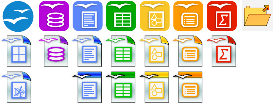
Improvement in icons to emphasize file type (enlarged application icon and colours, decrease in birds and black styling taking up space.)
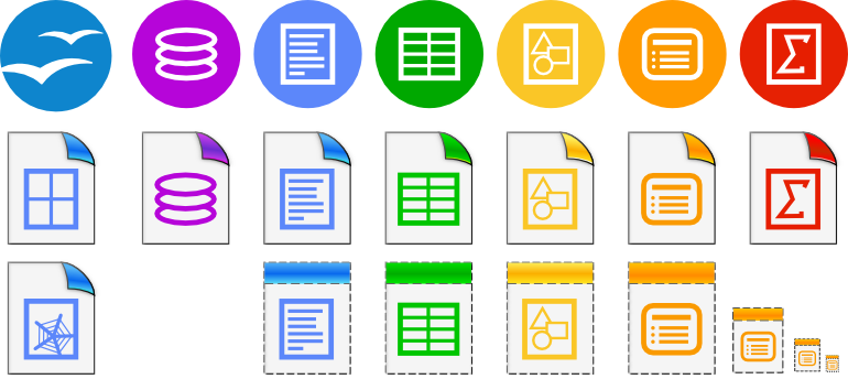
AOO Desktop Icon Exploration 2 (Round) - Samer Mansour
Rounded to match branding, Went flat, sharper, increased contrast between designator and background icon. Less busy, dropped the gulls.
Changed templates to be dotted, different perspective than we used in the past, left the solid bar at the top so previous 3.x users transition to new icon set.
I did not take action on the comment about the draw icon being a pen. One of the first experiences I had with draw was a blank page and drawing a circle and rectangle on it.
Upon scaling down, I can tweak line thicknesses to create sharper small set icons, I only scaled cheap to get this draft out on the mailing list for comments.