DUE TO SPAM, SIGN-UP IS DISABLED. Goto Selfserve wiki signup and request an account.
...
- It was conducted over the period 22nd - 25th July 2016.
- A total of 31 responses were recorded and the details are recorded below. One response was invalid so has not been included in any of the graph summaries.
Survey Catchment
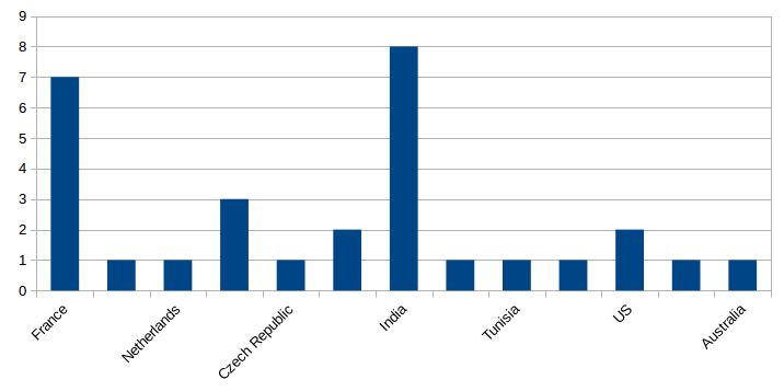
The vote attracted a input from a wide range of countries.
- The majority of responses came from India, followed by France
- It was good to see such an international community presence
Response Frequency
- The vote was open for 5 days (22nd - 26th July 2016)
- The majority of votes occurred on the first day

Vote Questions
...
- Only one option could be voted for
- Additional comment boxes were added for possible feedback
Additional Comments for Option 1 were as follows:
- Because it reminds me a music score sheet. Is looks as fluent as a music =))
- Just a thought, can we make 'B' capital in this. If not, still I like this. Thanks!
- too old fashion, don't respect caps OFB in the logo, feather colors are wrong.
Additonal Comments for Option 2 were as follows:
- my second option
- The nib on the first option would be better on this
Additional Comments for Option 3 were as follows:
- I prefer to have it in the same color as Apache to distinct from the OFBiz name (to not read COFBiz)
- Hesitation between first and third choice. the second is the worst ;)
- Not fan af the color, but seems the best logo, fresh and new. I particularly like monochrom
| Info |
|---|
| One person voted for 2 options instead of one so that vote has been removed from the figures. |
...