DUE TO SPAM, SIGN-UP IS DISABLED. Goto Selfserve wiki signup and request an account.
Could Chris R. please contact robweir at apache.org we need some information for a blog post.
Creative Brief
How might we update or enhance our product visual identifier/logo to best reflect our brand?
...
No wrong answers here, just a collection of sketches realizing the visual elements.
Kevin Grignon - Concepts
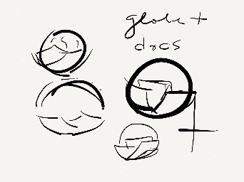
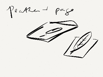
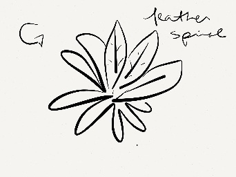


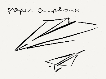
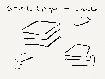
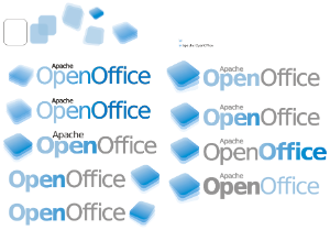
- docs
- transparent
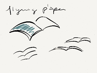
Lucas Filho - Concepts

1.Graham Lauder - Graphical Text for Logo text
...
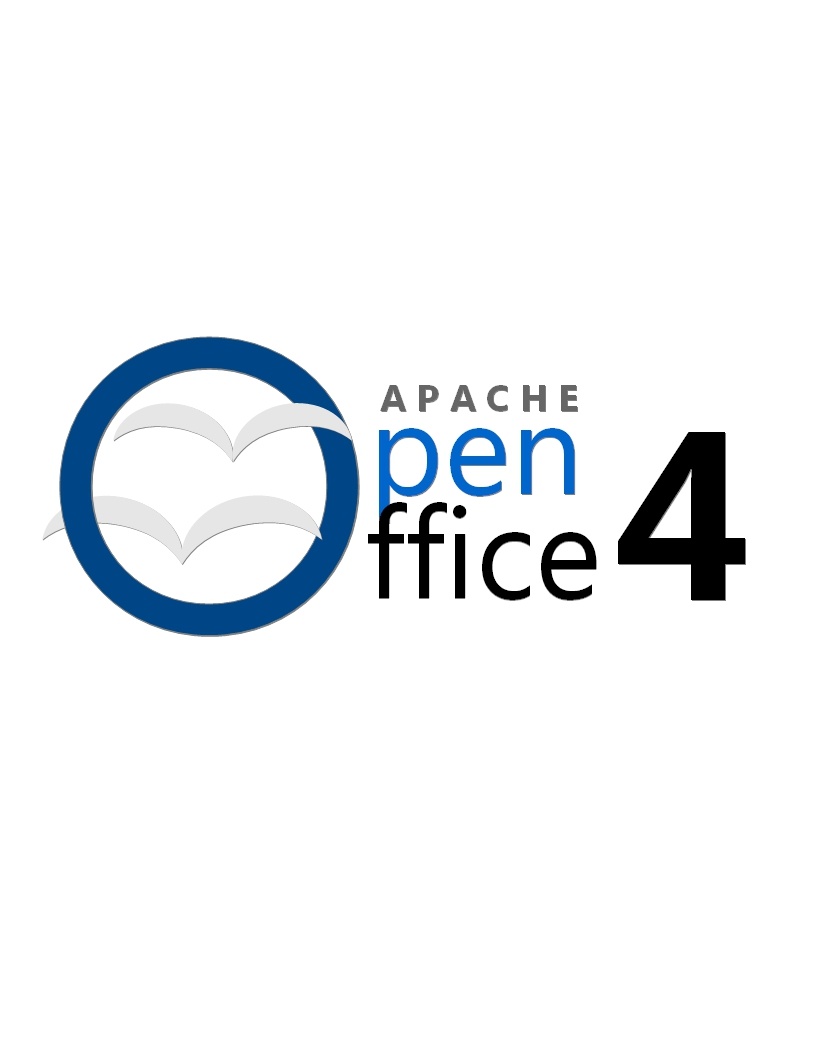
This logo proposal changes makes use of a new font and logo scheme to present the word OpenOffice by updating the orb as a flat surface and placing a "donut" hole (which represents the open nature of AOO as an open source project) in the orb along with our trademark gulls effectively making it an "O" which anchors the words "Open" and "Office" but with the use of a single "O". The logo also makes use of a new typeface.
3.Michael Acevedo - Concept Logo for AOO 4 Proposal #2 (12-19-2012)
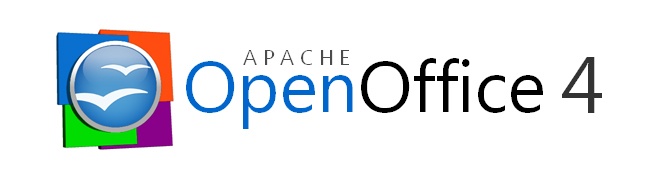
The second logo proposal for Apache OpenOffice 4 is more conservative, conventional, and simplistic than the previous logo proposal; which makes the new open office logo more recognizable among the community. The new logo proposal makes use of an updated OpenOffice orb which now rests on four squares that represents the four main applications associated with an office suite (Blue= Writer, Green= Calc, Orange= Impress, and Violet= Base). In addition the orb now is surrounded by a white belvel emboss ring that makes the logo look more like a pin and actually makes it stand out of the four background squares
. 
4.Michael Acevedo - Concept Logo for AOO 4 Proposal #3, 4, 5, 6, and 7 (12-20-2012)
Below there are 5 additional logos for the Apache OpenOffice project, all of these follow a similar language to logo proposal 2. 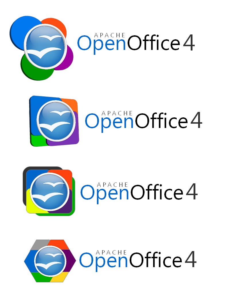
...
The following logo which I affectionately call "BlueCon", takes a cue of logo designs 9 and 10, but actually makes it simple by taking the multicolored rings away and repaints the icon to the OpenOffice blue color. As with proposal 9 and 10 seagull ring remains and the design for the word "openoffice" is carried over as well. This logo addresses observations made about logos 9 and 10 being "too crowded" due to the application rings. The new coloring of the icon represents the whole OpenOffice suite, something that the original seagull orb accomplished. Logo proposal 10 is oriented to be used on the office suite, where logo proposal 11 is geared towards being used on the project's webpage as the icon has been scaled down to be more header friendly. 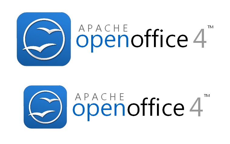
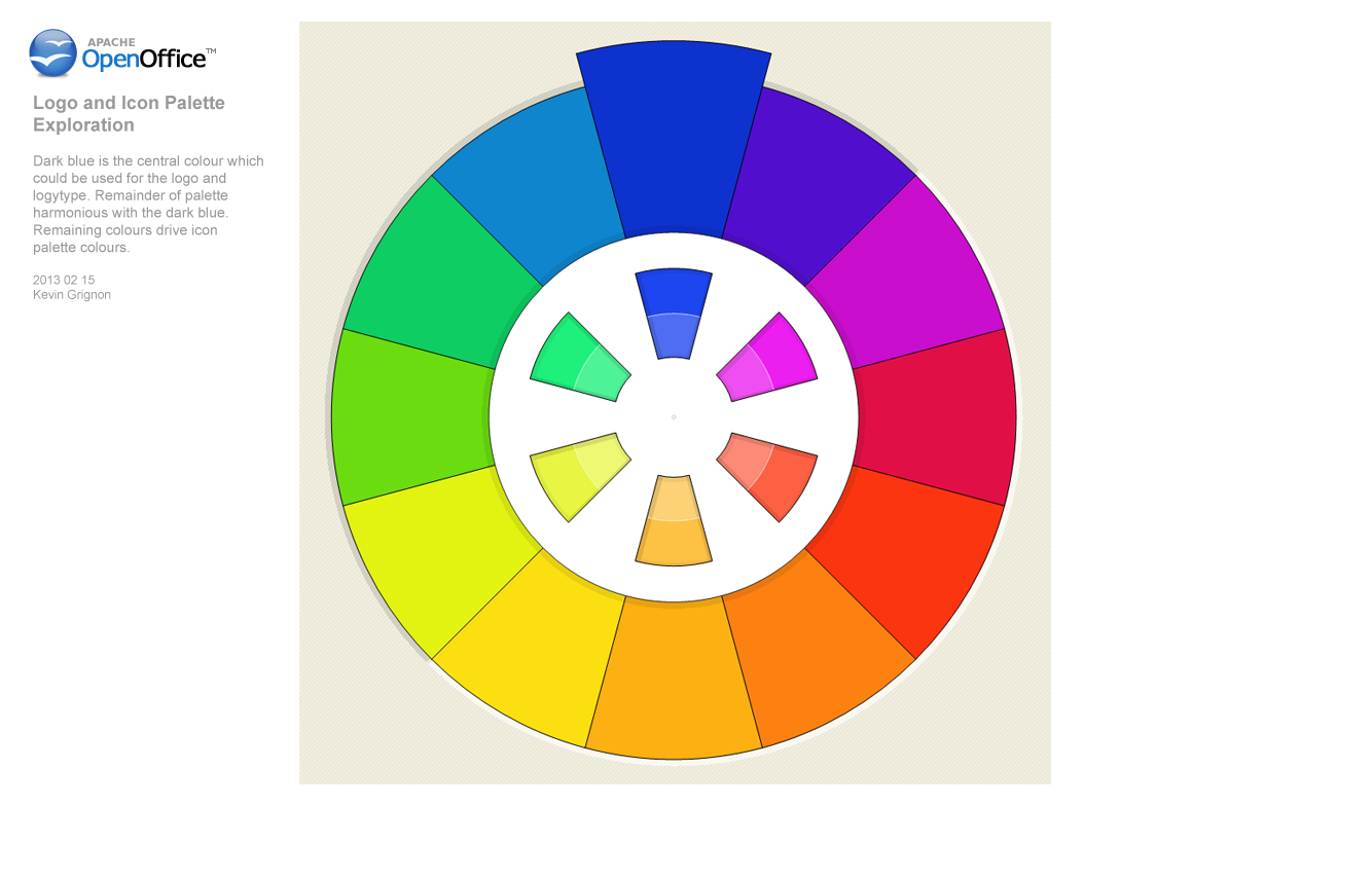
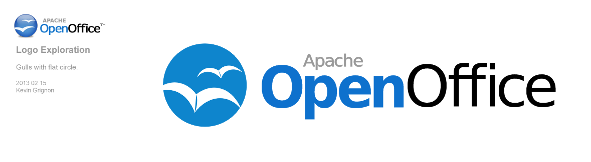
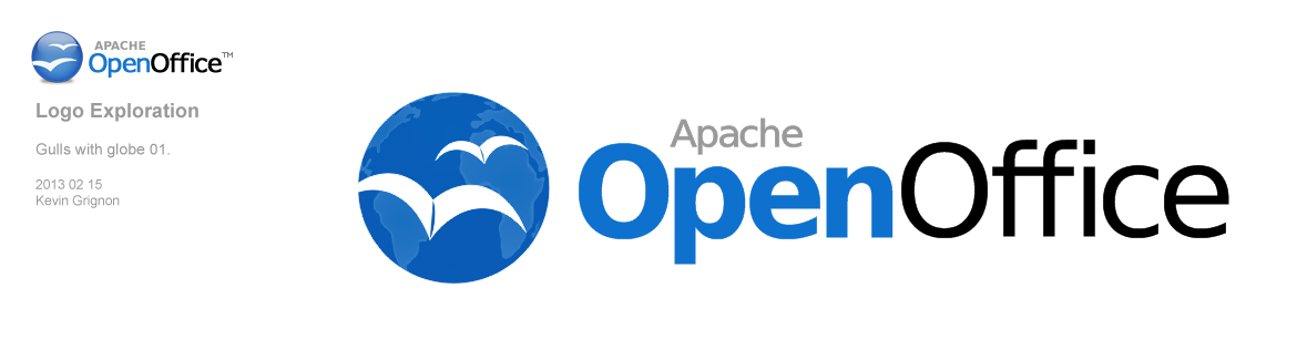
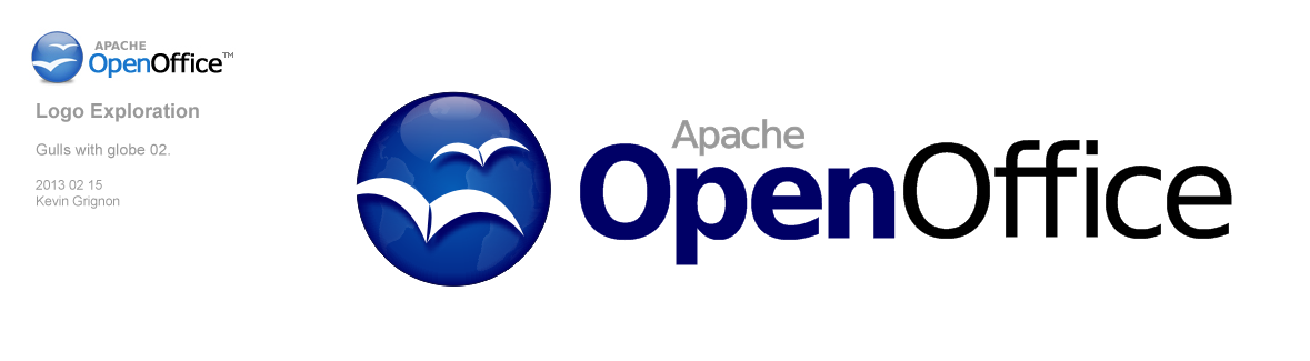
Kevin Grignon - Concept Logo for Apache OpenOffice 4.0 Proposals #12 and #13 (2-15-2013).
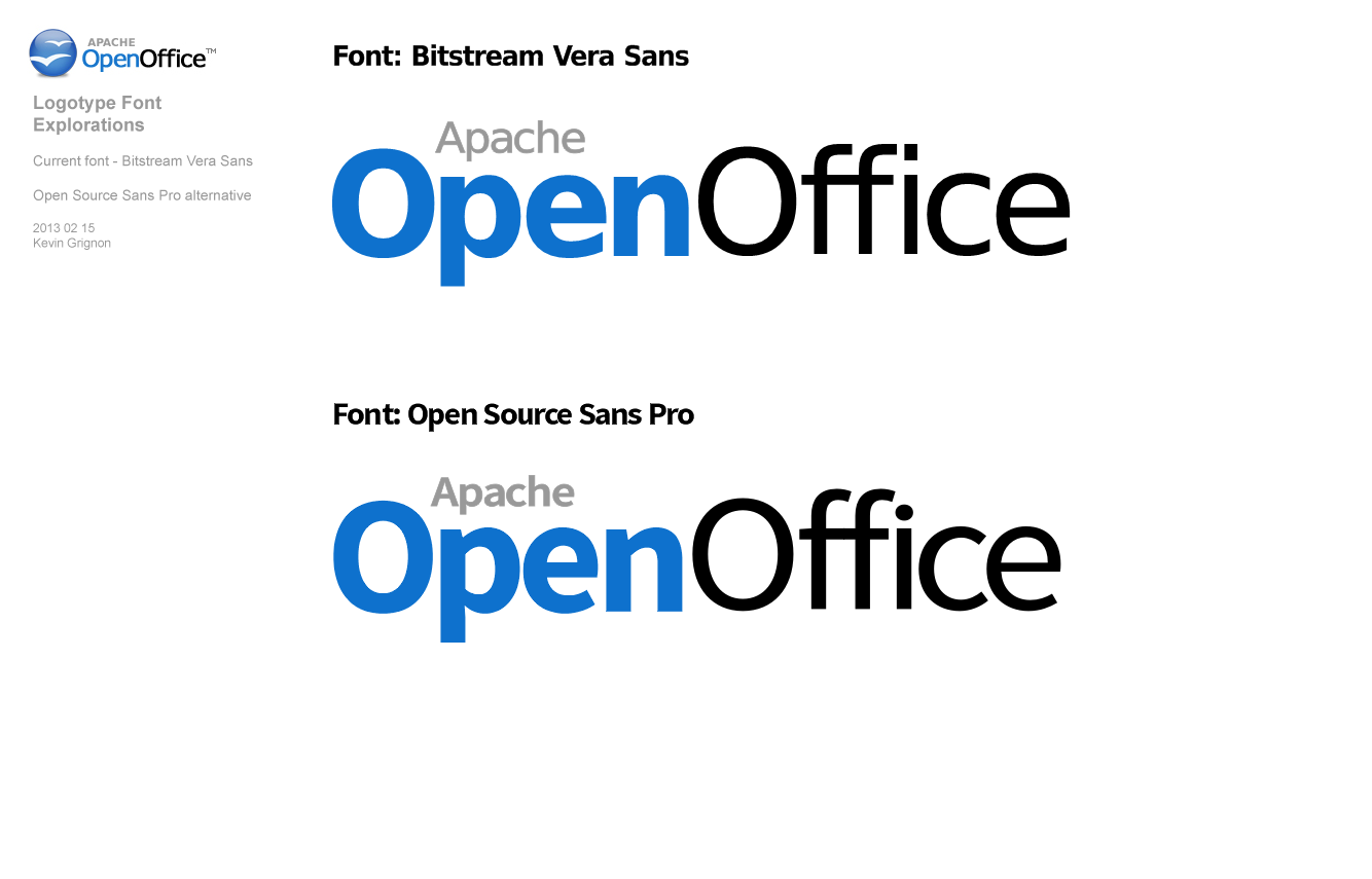
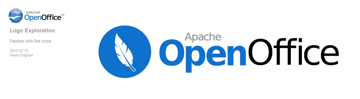

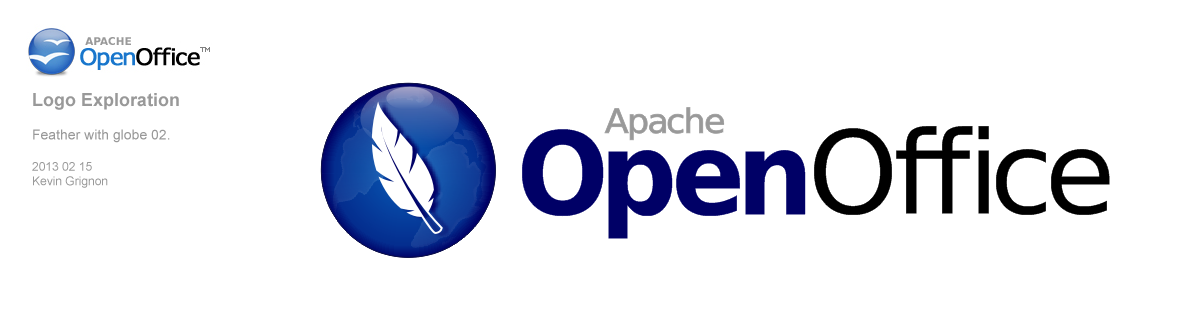
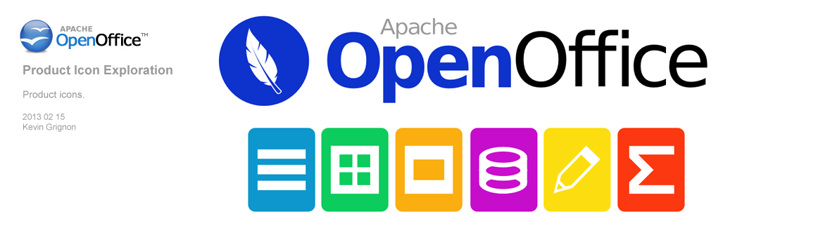
Notes
- consider a logo content, as seen in Flex
- Apache OpenOffice is a continuation of OpenOffice.org, consider retaining aspects of previous OpenOffice logo for continuity
- consider including Apache in logo
Test
Sample document attachment: sample_document.odt
...
Black outline is to help focus eyes. Second image is to show application to other branding activities, done with less effort.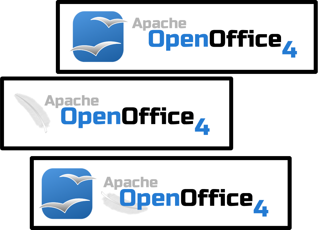
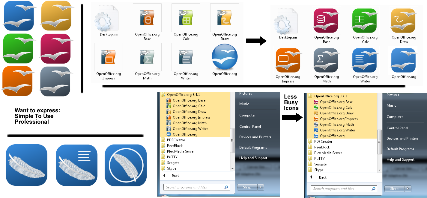
11. Chris R. - Clean flat style (Feb-Mar 2013)
Feb 2, 2013: Just a rough fast brainstorm test 
Without glossy or other "modish" style. Left away all "unnecessary elements": the brand should speak for itself.
Scales not bad at smaller sizes (app icons here 64px), but this is just to give an idea of my idea: icons are not optimzed (line thickness, etc.)

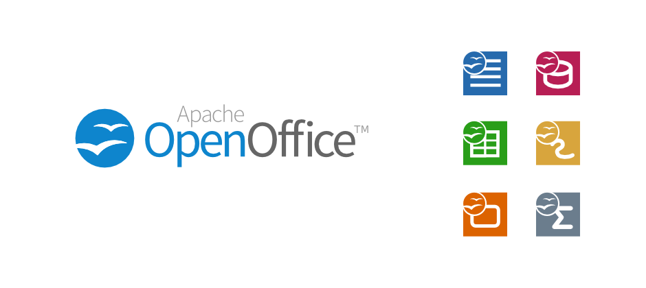
Mar 15, 2103: Got inspred by Kevin Grignon (Source Sans Pro font and color background) and at the same time found my first proposal inappropriate (missing Apache and Open).
Have used grey colors for the font and added TM.
Find this proposal much better.
Lucas Filho - Concepts 02
Using Google to write, sorry errors.
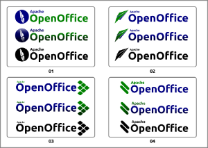
I present four proposals for logo Apache OpenOffice 4.0. In standard versions, and indeed black and white. For best viewing, download, and view separately.
01 - The proposal presents a shame apache inside a circle representing the world - ie, the world is Apache;
02 - Based on the scrawl of Kevin Grignon, the plane represents freedom. But we have two problems: the plane separately without the name does not remember the brand, we have no reference what it is. Second, I have already submitted a proposal similar to the LibreOffice project for some time (https://picasaweb.google.com/lh/photo/rht5jt8ISZiVAHIbyJ_QbtMTjNZETYmyPJy0liipFm0?feat=directlink);
03 - My favorite , shows six squares inclined. Each package represents programs (Writer, Calc, Impress, Base, Draw and Math). The set - name and objects, references an arrow (apache);
04 - The two objects can become a success in marketing. The two objects refer to painting done with fingers in the faces of Apache Indians. Imagine lectures around the world made with the speaker with his face painted (a headdress would be excellent to complement this case)!
This characterization would be a "trademark" of Apache OpenOffice. I'm not talking about using costumes through the streets, but the painting would be the basic (optional).
Em português:
Usando o Google para escrever, desculpe erros.
Apresento quatro propostas para logomarca do Apache OpenOffice 4.0. Em versões normal, com efeito e preto e branco. Para melhor visualização, fazer download e ver em separado.
01 - A proposta apresenta uma pena apache dentro de um círculo que representa o mundo - ou seja, o mundo é Apache;
02 - Baseado no rabisco de Kevin Grignon, o avião representa a liberdade. Mas temos dois problemas: o avião em separado sem o nome não lembra a marca, não temos referência do que se trata. O segundo, já enviei uma proposta parecida ao projeto LibreOffice há algum tempo (https://picasaweb.google.com/lh/photo/rht5jt8ISZiVAHIbyJ_QbtMTjNZETYmyPJy0liipFm0?feat=directlink);
03 - Minha preferida : ), mostra seis quadrados inclinados. Cada um representa os programas do pacote (Writer, Calc,Impress, Base,Draw e Math). O conjunto - nome e objetos, faz referência a uma seta (apache);
04 - Os dois objetos podem se transformar em um caso de sucesso em marketing. Os dois objetos fazem referência a pintura feita com dedos nos rostos dos índios apaches. Imaginem as palestras ao redor do mundo feitas com o palestrante com o rosto pintado (um cocar como complemento seria excelente neste caso)!
Esta caracterização seria uma "marca registrada" do Apache OpenOffice. Não estou falando de usar vestimentas pelas ruas, mas a pintura seria o básico (opcional).

| Anchor | ||||
|---|---|---|---|---|
|
13. Samer Mansour - Flat & Slim
Building on Chris R. Direction. Fonts are Apache License 2.0 fonts. This is in the direction of a refresh rather than a new logo.
Can also adjust to make f's touch.

Open Sans Light

Open Sans - 'Apache' still in Open Sans Light though

Roboto
14 Pavel Vasilyev - Classic Apache feather & Name

15 Abhimanyu Singh
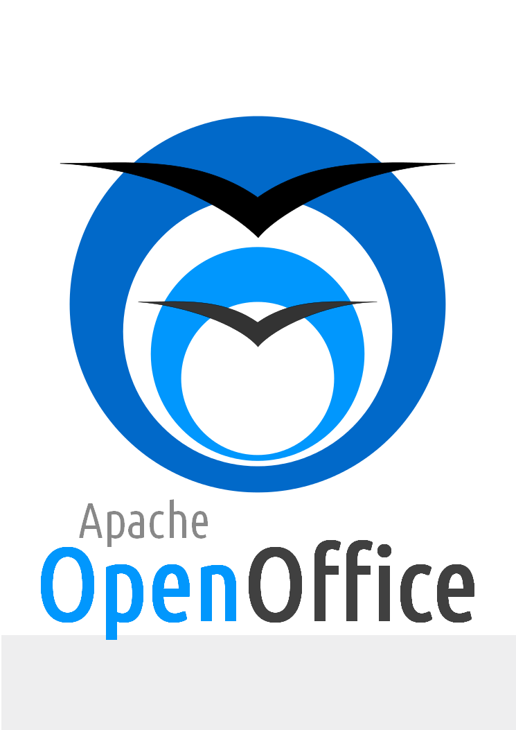
Built using Inkscape. Font used is UbuntuCondensed-Regular (under UFL). Minimalistic and Gradient less logo. Two O's lined up to look like a tunnel and 2 Gulls coming put of it, representing freedom.
16 Robin Fowler - Logo proposal OpenOffice 4 (29.03.2013) Updated 08.04.2013
Judging by feedback the new logo should be evolutionary rather than revolutionary. This design provides a simplistic and modernised twist to the current logo. Adding just that little bit of depth to make it stand out from similar styles (microsoft), it still delivers the 'flat' look many of you have proposed. The feather represents the apache brand as well as giving the logo a more unique and recognisable form (rather just a plain circle). There will be more thought given to the implementation of the feather.
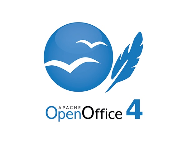
Here is a revised version of my first proposal as well as my second proposal without feather:
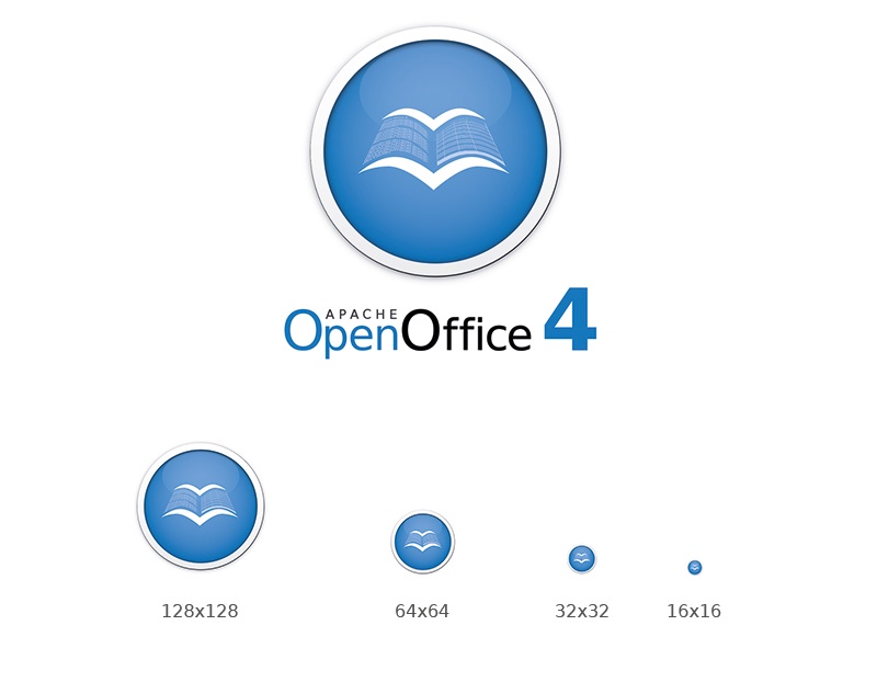
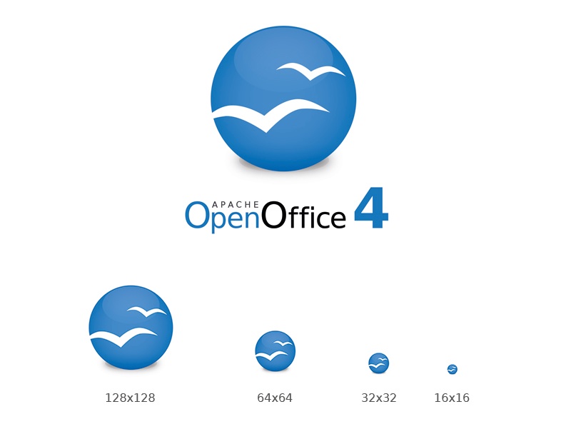
17 Samer Mansour - 31.03.2013
If people like the feather I suggest we try to incorporate it into the current logo, although when its too small it loses its shape when scaled down.
From the left to the right: 1 Current logo, 2 lighter current logo, 3 flatter logo (Similar to Robin's), 4 All Flat with lighter blue, 5 All flat with official blue.

18 Can Ünlüsoy - Logo Proposal
A different color palette is suggested. I tried a squarish shape for the icon and it now looks just like an app icon. Simple, clean and recognizable.
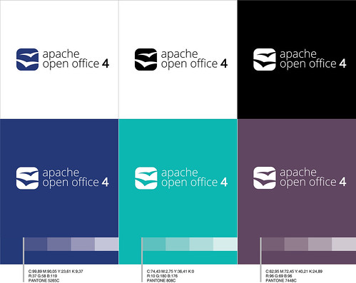
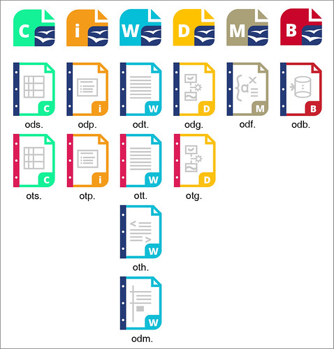
22.04.13- I have added the icons for my proposal. They don' t include the gulls, but they can be added.
19 Antoine - one other Aoo logo proposal
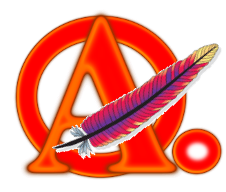

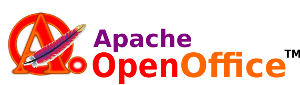


Draft logo proposal done with DejaVu fonts, available as a svg file done with Inkscape. The Apache feaser could be replaced by an other feather design if requested.
The red hot colors are suggested here to get a better marketing penetration compared with flat common offices brands.