DUE TO SPAM, SIGN-UP IS DISABLED. Goto Selfserve wiki signup and request an account.
Could Chris R. please contact robweir at apache.org we need some information for a blog post.
Creative Brief
How might we update or enhance our product visual identifier/logo to best reflect our brand?
...
No wrong answers here, just a collection of sketches realizing the visual elements.
Kevin Grignon - Concepts
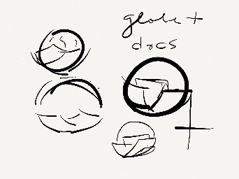
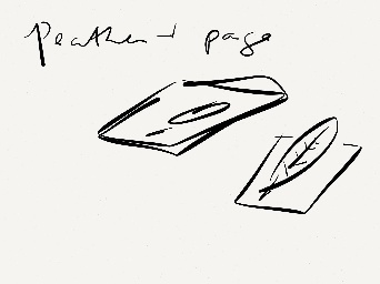
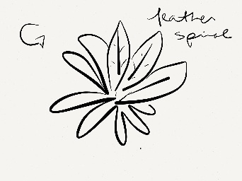


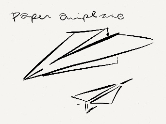
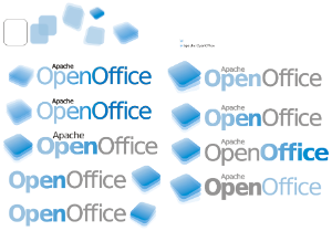
- docs
- transparent
Lucas Filho - Concepts

1.Graham Lauder - Graphical Text for Logo text
...
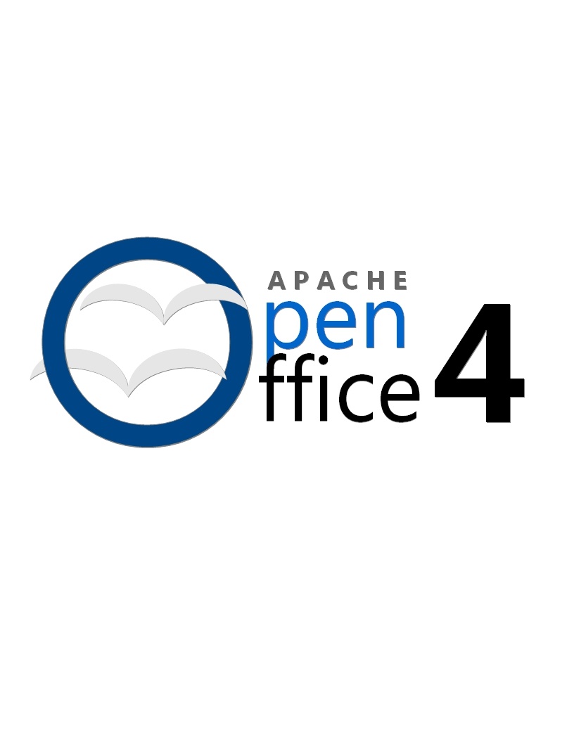
This logo proposal changes makes use of a new font and logo scheme to present the word OpenOffice by updating the orb as a flat surface and placing a "donut" hole (which represents the open nature of AOO as an open source project) in the orb along with our trademark gulls effectively making it an "O" which anchors the words "Open" and "Office" but with the use of a single "O". The logo also makes use of a new typeface.
3.Michael Acevedo - Concept Logo for AOO 4 Proposal #2 (12-19-2012)
The second logo proposal for Apache OpenOffice 4 is more conservative, conventional, and simplistic than the previous logo proposal; which makes the new open office logo more recognizable among the community. The new logo proposal makes use of an updated OpenOffice orb which now rests on four squares that represents the four main applications associated with an office suite (Blue= Writer, Green= Calc, Orange= Impress, and Violet= Base). In addition the orb now is surrounded by a white belvel emboss ring that makes the logo look more like a pin and actually makes it stand out of the four background squares
. 
4.Michael Acevedo - Concept Logo for AOO 4 Proposal #3, 4, 5, 6, and 7 (12-20-2012)
Below there are 5 additional logos for the Apache OpenOffice project, all of these follow a similar language to logo proposal 2. 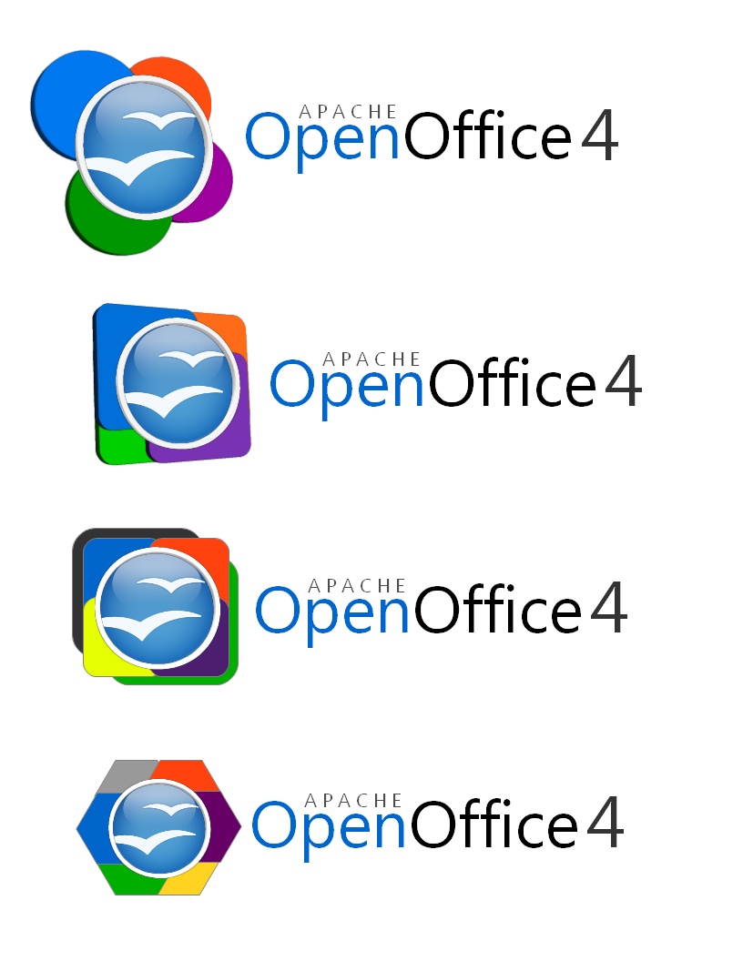
...
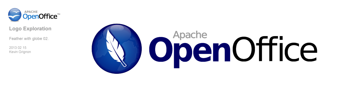
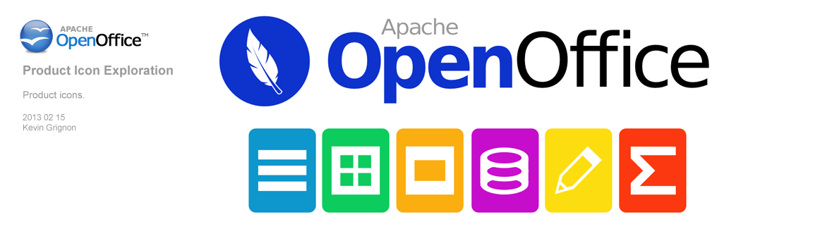
Kevin Grignon - Concept Logo for Apache OpenOffice 4.0 Proposals #12 and #13 (2-15-2013).
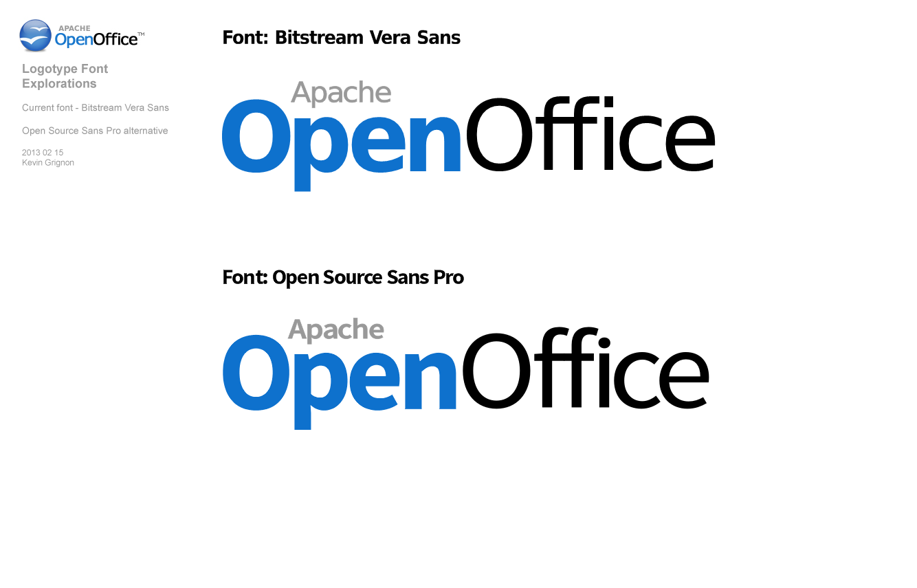
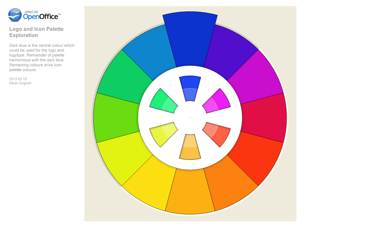
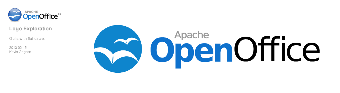
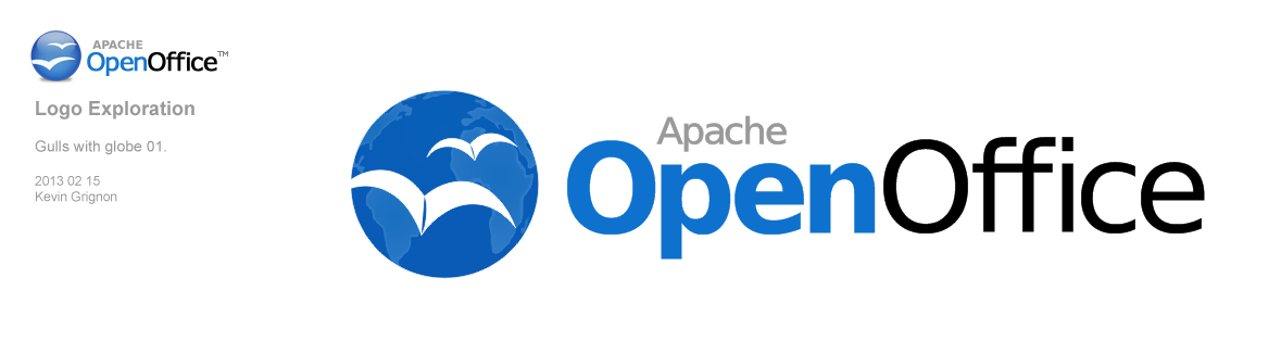
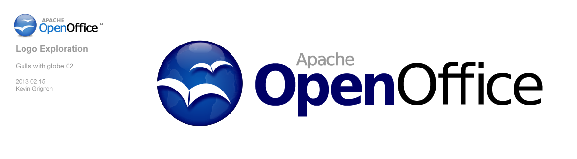
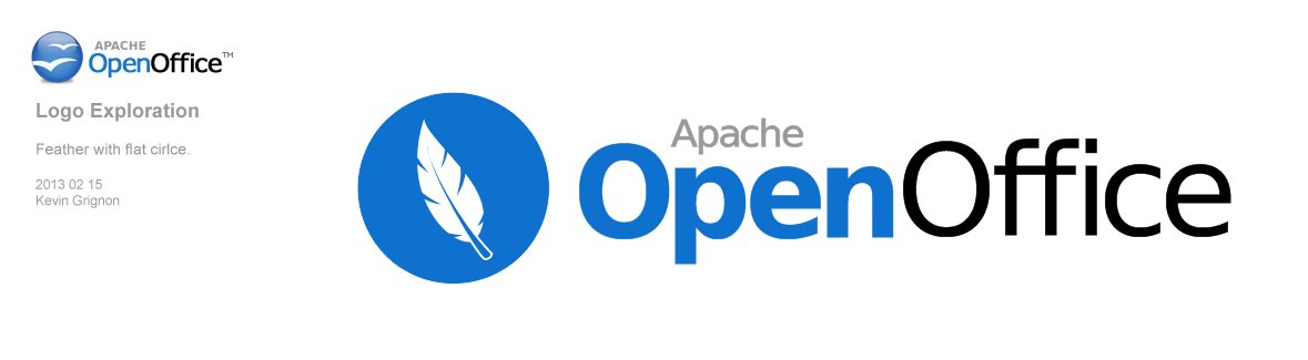

Notes
- consider a logo content, as seen in Flex
- Apache OpenOffice is a continuation of OpenOffice.org, consider retaining aspects of previous OpenOffice logo for continuity
- consider including Apache in logo
Test
Sample document attachment: sample_document.odt
...
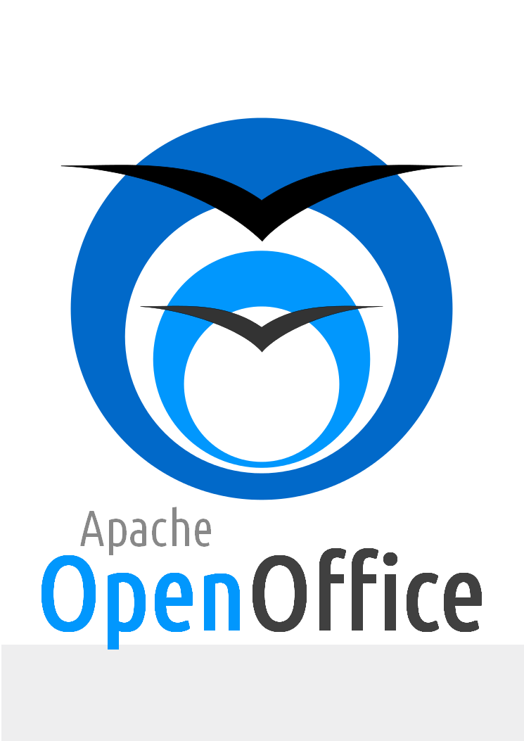
Built using Inkscape. Font used is UbuntuCondensed-Regular (under UFL). Minimalistic and Gradient less logo. Two O's lined up to look like a tunnel and 2 Gulls coming put of it, representing freedom.
16 Robin Fowler - Logo proposal OpenOffice 4 (29.03.2013) Updated 08.04.2013
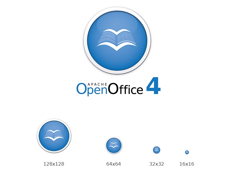
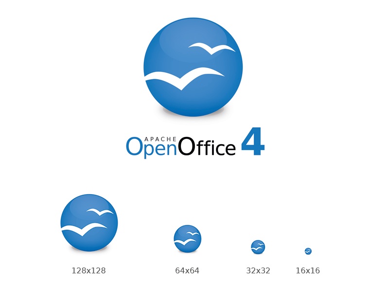
Judging by feedback the new logo should be evolutionary rather than revolutionary. This design provides a simplistic and modernised twist to the current logo. Adding just that little bit of depth to make it stand out from similar styles (microsoft), it still delivers the 'flat' look many of you have proposed. The feather represents the apache brand as well as giving the logo a more unique and recognisable form (rather just a plain circle). There will be more thought given to the implementation of the feather.
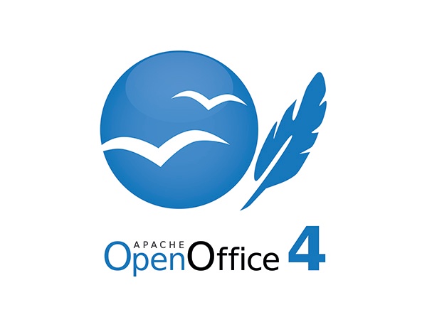
Here is a revised version of my first proposal as well as my second proposal without feather:
17 Samer Mansour - 31.03.2013
If people like the feather I suggest we try to incorporate it into the current logo, although when its too small it loses its shape when scaled down.
From the left to the right: 1 Current logo, 2 lighter current logo, 3 flatter logo (Similar to Robin's), 4 All Flat with lighter blue, 5 All flat with official blue.

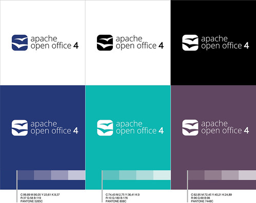
18 Can Ünlüsoy - Logo Proposal
A different color palette is suggested. I tried a squarish shape for the icon and it now looks just like an app icon. Simple, clean and recognizable.
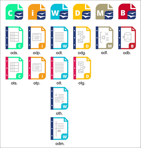
22.04.13- I have added the icons for my proposal. They don' t include the gulls, but they can be added.
19 Antoine - one other Aoo logo proposal
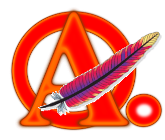




Draft logo proposal done with DejaVu fonts, available as a svg file done with Inkscape. The Apache feaser could be replaced by an other feather design if requested.
The red hot colors are suggested here to get a better marketing penetration compared with flat common offices brands.