...
| 3.4.1
| 4.0 Proposed
|
|---|
Shape
256px
|  
This is for documents.
The Templates are similarly designed
Rather than the page corner in the top right, its in the bottom right.
As well the top of the page has a solid color designating it as a template.
| 
More Usable? Yes.
- Primary Context (Application Designation - Red). Secondary Context (Application Brand - Green)
- Corner And Designator Color (keep from old design), user can identify the file type quickly by color and designator.
- Enlarged Designation, helps color blind and hard of seeing individuals.
- Mime designation, helps users differentiate file type when the above two fail to help, include when screen space permits MIME Type is not important to this audience, brain-spill-over from my technical side, technical files like .XML & .XSD. -Samer.
- Additionally, the color of the MIME type could be different for further differentiation of template files.
- Single gull, or maybe O or circle can satisfy secondary element, less busy yet gets the brand across.
|
64px |  
Optimal size, great for showing how fabulous and sophisticated our product is.
| 
At this level we keep the MIME designation but the three characters at a little larger.
|
32px
|  
At this level we should still be able to see the branding well as well as identifying the file type quickly
| 
At this level we drop the MIME designation, space is limited and mime type becomes less likely to help identify or connect with the user.
|
16px
|  
At 16px, space is limited, we want to be the lease least busiest.
| 
Might need to drop the branding to make less busy. (Green)
Our focus should be to be the best user experience, and that might mean dropping the branding to be much more helpful to the user.
|
Legend
| Green - Branding (Twin Gulls)
Red - Application Designation
Orange - Page Corner (Colored)
| Green - Branding (Approx 1/8 icon)
Red - Application Designation (Approx 1/2 icon)
Orange - Colored Page Corner (Approx 1/8 icon)
Blue - MIME Designation (Approx 1/8 icon)
|
...
Palette is based on AOO blue as key colour.
AOO Desktop Icon Exploration - Samer Mansour
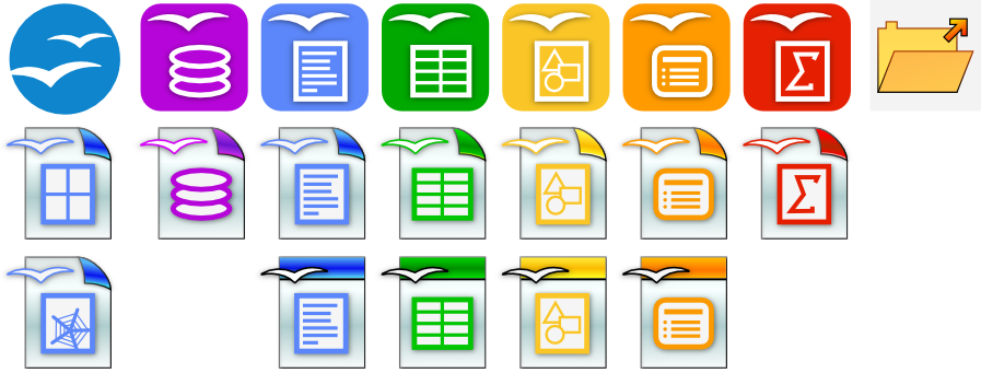 Image Added
Improvement in icons to emphasize file type (enlarged application icon and colours, decrease in birds and black styling taking up space.)
AOO Desktop Icon Exploration 2 (Round) - Samer Mansour
Rounded to match branding, Went flat, sharper, increased contrast between designator and background icon. Less busy, dropped the gulls.
Changed templates to be dotted, different perspective than we used in the past, left the solid bar at the top so previous 3.x users transition to new icon set.
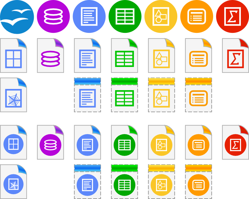 Image Added
Then I thought keep the circle theme going (lines don't scale down as nicely in circle version because its smaller to start with):
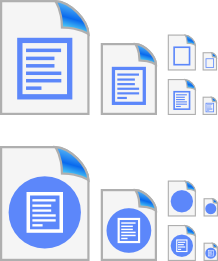 Image Added