DUE TO SPAM, SIGN-UP IS DISABLED. Goto Selfserve wiki signup and request an account.
...
Michael Acevedo - Concept Logo for AOO 4 Proposal #1 #2 (12-1519-2012)
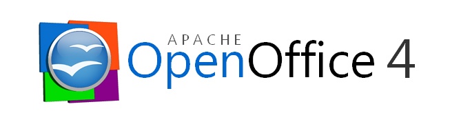
The second logo proposal for Apache OpenOffice 4 is more conservative, conventional, and simplistic than the previous logo proposal; which makes the new open office logo more recognizable among the community. The new logo proposal makes use of an updated OpenOffice orb which now rests on four squares that represents the four main applications associated with an office suite (Blue= Writer, Green= Calc, Orange= Impress, and Violet= Base). In addition the orb now is surrounded by a white belvel emboss ring that makes the logo look more like a pin and actually makes it stand out of the four background squares
. 
Michael Acevedo - Concept Logo for AOO 4 Proposal #3, 4, 5, 6, and 7 (12-20-2012)
Below there are 5 additional logos for the Apache OpenOffice project, all of these follow a similar language to logo proposal 2. 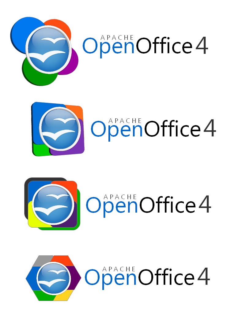

Notes
- consider a logo content, as seen in Flex
- Apache OpenOffice is a continuation of OpenOffice.org, consider retaining aspects of previous OpenOffice logo for continuity
- consider including Apache in logo
...