DUE TO SPAM, SIGN-UP IS DISABLED. Goto Selfserve wiki signup and request an account.
Creative Brief
How might we update or enhance our product visual identifier/logo to best reflect our brand?
Brand Attributes
The Apache OpenOffice brand reflects the following attributes:
- global
- open
- transparent
- accessible
- clean
- strong
- leader
- approachable
- innovative
- modern
- sharp
- usable
- lightweight
Visual Elements
The following visual elements are associate with the Apache OpenOffice products:
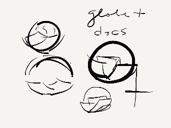
- globe, orb, circle
- document, page, square, rectangle
- transparent materials
- letter O & O
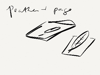
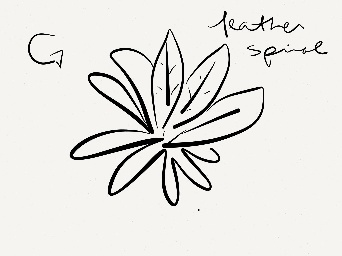
- apache feather
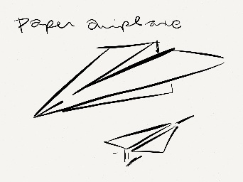
- gulls, page curls
- document, book, booklet
Brainstorming
No wrong answers here, just a collection of sketches realizing the visual elements.
Kevin Grignon - Concepts


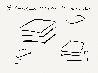
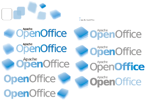
- docs
- transparent
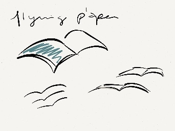
Lucas Filho - Concepts

Graham Lauder - Graphical Text for Logo text
This is another example of a text graphic created in inkscape used instead of some type of typeface. It's a San Serif type font and can be modified as an svg. 
PNG version: 
Michael Acevedo - Concept Logo for AOO 4 (12-15-2012)
This logo proposal changes makes use of a new font and logo scheme to present the word OpenOffice by updating the orb as a flat surface and placing a "donut" hole (which represents the open nature of AOO as an open source project) in the orb along with our trademark gulls effectively making it an "O" which anchors the words "Open" and "Office" but with the use of a single "O". The logo also makes use of a new typeface. 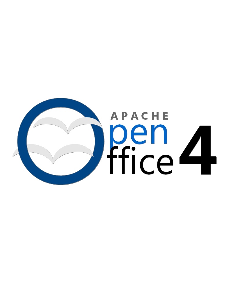
Notes
- consider a logo content, as seen in Flex
- Apache OpenOffice is a continuation of OpenOffice.org, consider retaining aspects of previous OpenOffice logo for continuity
- consider including Apache in logo
Test
Sample document attachment: sample_document.odt